
What is Responsive Website Design?

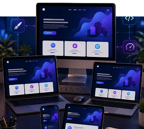
These days, pretty much everyone has a smartphone. And a tablet. And maybe a smart watch. It’s a lot of different screens to look at, right? Well, if you’re building a website, you need it to look good and work well on all of them. That’s where Responsive Web Design comes in. It’s basically a way to make your website act like a chameleon, changing its appearance to fit whatever screen it’s being viewed on. No more pinching and zooming on your phone to read tiny text!

So, what exactly is responsive website design? Basically, it’s a way of building websites so they look good and work well no matter what device someone is using to view them. Think about it – people check websites on their phones, tablets, laptops, and big desktop monitors. A responsive website design automatically adjusts its layout, images, and text to fit whatever screen size it’s being viewed on. It’s not about creating a separate site for phones and another for desktops; it’s one site that adapts.

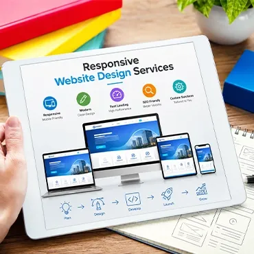
Responsive Website Design Services

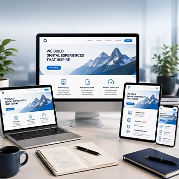
It’s not just about making a website look okay on a phone. It’s about making sure your site works well for everyone, no matter what device they’re using. Think about it: people are browsing on everything from tiny smartwatches to big desktop monitors these days. A good responsive website design Services builds a single website that adapts smoothly to all those different screen sizes.

We focus on creating a user experience that feels natural and easy to use, whether someone is on their commute or at their desk. This means the layout might shift, images might resize, and navigation could change – all automatically. It’s like a chameleon, changing its appearance to fit its surroundings.

When you’re choosing a web design company, look for one that talks about more than just pretty pictures. We should be thinking about:

Responsive Website Design Services
  • Content Prioritization: What’s most important for users to see on a small screen? They need to figure out how to show that clearly without endless scrolling.
  • Performance: A website that takes ages to load on a mobile connection is a lost opportunity. They should be optimizing everything so it’s fast, even on weaker networks.
  • Usability Testing: Do they actually test the site on different devices and in different conditions? It’s one thing to design it, another to make sure it actually works well in the real world.

It’s a bit of a puzzle, really. How do you take a design that looks great on a big screen and make it just as effective on a tiny one? That’s where the skill comes in. We use techniques like fluid grids and media queries to make sure elements rearrange themselves smartly. It’s not just about shrinking things down; it’s about thoughtful reorganization.

Finding the right team can make a big difference. You want a partner who understands the technical side but also keeps the end-user in mind. They should be able to explain how they’ll handle different screen sizes and what trade-offs might be necessary. For example, sometimes certain decorative elements might be hidden on smaller screens to keep things clean and fast. It’s all about making smart choices for a better user journey.

Benefits Of Responsive Website Design Services

So, why bother with responsive design? It’s not just a fancy term; it’s about making sure your website actually works for people, no matter what gadget they’re using. Think about it: your site might look great on a big desktop monitor, but if it’s a jumbled mess on a phone, you’re losing visitors. That’s a big problem.

Responsive design means you have one website that adapts to fit any screen. This is a huge deal for a few reasons.

First off, it makes things simpler. Instead of managing multiple versions of your site – one for desktops, one for tablets, one for phones – you’ve got a single codebase. This means less work for developers and easier updates down the line. You update the content once, and it shows up everywhere.

Here are some of the main advantages:

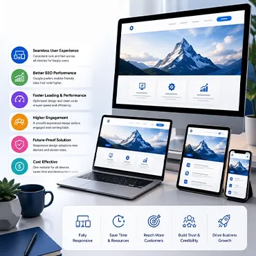
  • Better User Experience: People get frustrated easily. If your site is hard to read or use on their phone, they’ll just leave. Responsive website design services makes sure your content is easy to see and interact with, whether it’s on a tiny phone screen or a massive monitor. This keeps people on your site longer.
  • Improved SEO: Search engines like Google tend to favor websites that are mobile-friendly. Having a responsive website design can help your site rank higher in search results, meaning more people will find you.
  • Cost-Effectiveness: Building and maintaining separate sites for different devices adds up. A single responsive website is generally more budget-friendly in the long run.
  • Future-Proofing: New devices and screen sizes pop up all the time. Responsive website design is built to adapt, so your site is more likely to work well on future devices without needing a complete overhaul.
Benefits Of Responsive Website Design Services

Basically, if you want more people to visit your website and stick around, responsive website design isn’t just a good idea; it’s pretty much a necessity these days.

Hire Responsive Web Designer

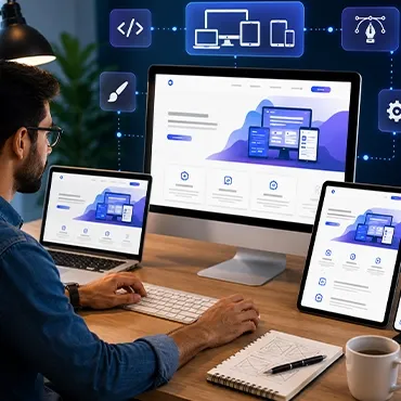
So, you’re looking to get a website that works everywhere, right? That’s where hiring a responsive web designer comes in. It’s not just about making a site look okay on a phone; it’s about making sure it’s actually usable and looks good whether someone’s on a giant desktop monitor or a tiny smartwatch.

Finding the right Web Designer means looking for someone who understands how content needs to shift and rearrange itself. It’s like a puzzle, really. How do you take a layout that works great on a wide screen and make it fit neatly onto a narrow one without losing anything important? That’s the challenge.

Here’s what you should look for:

Hire Responsive Web Designer
  • Experience with Fluid Grids: They should know how to build layouts that flex and adapt using percentages instead of fixed pixels. This is key for making things scale smoothly.
  • Understanding of Media Queries: This is the technical bit that lets the website know what screen size it’s being viewed on and apply different styles accordingly. It’s how the magic happens.
  • Focus on User Experience (UX) Across Devices: A good designer won’t just make it fit; they’ll make it work well. This means testing on actual devices to see how things feel and function.
  • Content-First Approach: Sometimes, trying to cram too much complex stuff onto a small screen just doesn’t work. A good designer will help you figure out what’s most important and how to present it best for each device.

When you’re interviewing potential web designers, ask them about their process. Do they test on multiple devices? How do they handle different screen orientations? What’s their approach to performance, because a slow-loading site is a bad experience on any device? Getting a website that adapts well isn’t just a technical requirement; it’s about making sure everyone who visits your website has a good time, no matter how they’re viewing it.

Why Us

When you’re looking for someone to build your website, you want a team that really gets how things work on the internet today. We focus on making sure your website looks good and works well on any device, whether it’s a giant desktop monitor or a tiny phone screen. It’s not just about making things smaller or bigger; it’s about rearranging content so it makes sense and is easy to use everywhere.

We don’t just use templates blindly. We look at what makes your specific project unique and build a solution that fits. Our goal is to create a website that not only meets your needs today but is also ready for whatever devices come out tomorrow. We think that’s pretty important.

We know that a good responsive design means thinking about how people actually use your site. That’s why we pay close attention to the details:

Content First Approach

We start with your content and figure out the best way to present it, no matter the screen size. This means your message always comes through clearly.

User Experience Focus

We test how your site feels and functions on different devices. A clunky experience on a phone can lose you customers, and we work hard to avoid that.

Flexible Layouts

Using smart techniques, we create layouts that adapt smoothly. A three-column setup on a desktop might become a single, easy-to-read column on a mobile, for example.

Performance Optimization

A beautiful site that loads slowly isn't much good. We make sure your site is quick and responsive, not just in layout but in speed too.

Frequently Asked Questions

What exactly is responsive website design?

Responsive website design is like giving your website a superpower to change its look based on the device it's being viewed on. Whether it's a giant computer screen, a handy tablet, or a tiny phone, the website automatically adjusts its layout so everything looks good and is easy to use. It's all about making one website work perfectly for everyone, no matter their screen size.

Why is responsive website design so important these days?

People use all sorts of devices to go online nowadays! If a website doesn't look right on a phone, people might just leave and find another one that does. Responsive website design makes sure your site is friendly to all these devices, meaning more people can see your content and use your site without getting frustrated.

Does responsive website design mean I need a totally different website for phones?

Nope! That's the cool part. With responsive website design, you only need one website. It uses smart coding (like CSS) to rearrange and resize things on the fly. So, instead of building three or four separate websites, you build one that cleverly adapts to fit any screen.

How does a website know what size screen it's on?

Websites use something called 'media queries.' Think of them like little checks that ask the browser, 'Hey, how wide is your screen right now?' Based on the answer, the website applies different styles to make sure it looks just right for that specific screen size.

Can some parts of a website be hidden on smaller screens?

Yes, definitely! Sometimes, to make things look cleaner on a small phone screen, certain things like big background pictures or extra navigation links might be hidden. The goal is to show the most important stuff first and make sure it's easy to find and use.

Is responsive website design good for my website's speed?

Responsive web design sends the same basic code to all devices. This means a phone might get code for things it doesn't even show. Good responsive design focuses on making sure the website loads quickly on all devices, especially phones that might have slower internet.