Responsive Website Development – Welcome to the Future of Web 2.0
November 15, 2014
Broadening scopes of web technology opportunities is exciting, but the real question is; are we prepared to handle it. Though the patronage of smart phones and other mobile computing devices in surfing the web is growing exponentially, most of our websites are not fluid to serve them practically. The mismatch between the perceptions comes out of the lack of
Responsive Website Development.
What can a Responsive Designer do for you?
Modular web designing is the beginning of a new era where leaving Photoshop bounds makes a huge difference. Overcoming common limits of pixels and fixed widths is possible with the help of a
Responsive Designer and the concept featuring
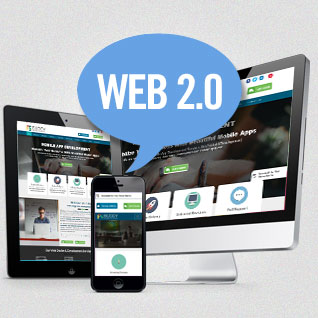
One Website for All Screens. The amalgamation of these essentialities is necessary and in turn and delivers more than envisaged.
Mixed approach rendering fluid width for all portable computing devices and fixed width for medium and large screens is the essence of the day. In fact, selection of compatible front-end framework with adaptability with this approach is very crucial. Simplifying the viewing experience of your website on every platform ever available is amazing and it is the greatest advantage of responsive website designing to count on.
Handle the Fundamental Shift Intuitively
Dynamism of Web 2.0 is radically changing with the emergence of new technologies and their straightforward integration in our lifestyle. Intuitive handling of these fundamental shifts with apt
Responsive Designer is imperative today and even more for tomorrow. Getting ready to serve a large audience on vivid platforms like desktops, phablets, TVs, consoles, smart phones, and virtually every viewing device is amazing and it truly assists you to enhance the opportunities of online presence and remarkable visibility. Gone are the days of fixed width and pixel bound fixed aspect ratios. The fluidity of the website is all that matters when your online presence in the cutting-edge competition is considered.
Single, double, or multiple column view; get prepared to serve every screen. Do not let amazingly attractive opportunities wither away due to the designing rigidity. Optimize your website with
Responsive Website Development and be responsive to every viewer. Well, you never know when opportunity knocks and from which screen.